This week I heard about the .NET Security Cheat Sheet written by the owasp guys. So I opened it up on my mobile and saw this:
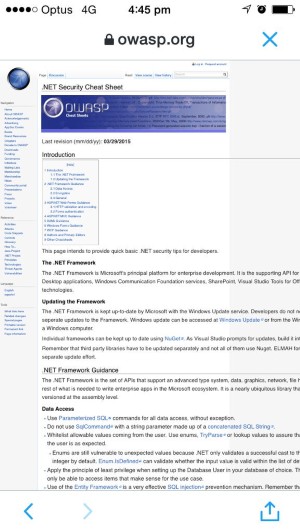
Eish. The text is tiny and you need to scroll around the screen to be able to read a sentence. Someone needs a mobile friendly CSS! So I tweeted them and got this response:
@voiceofapollo Volunteer organization of security geeks. Not a lot of designers among us. Still, you are right.
— Bill Sempf (@sempf) January 20, 2016Fair enough.
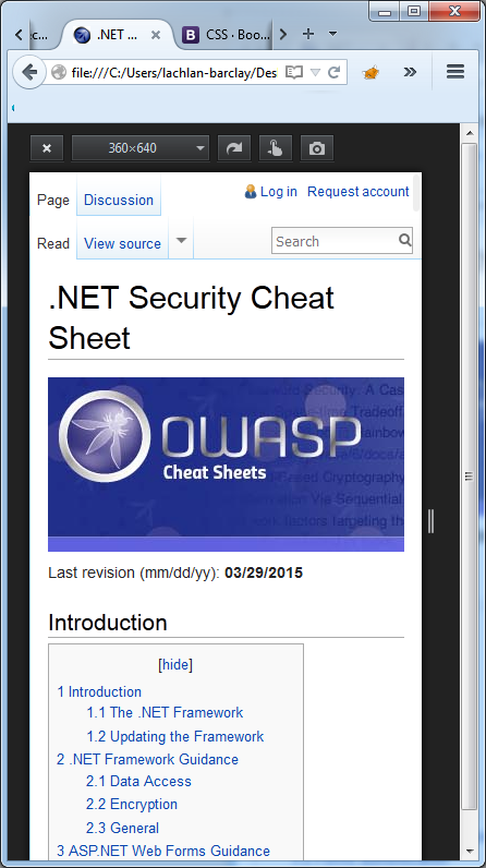
So I fixed it… how’s this?
The “main” culprit was the TABLE tag inside the HTML:
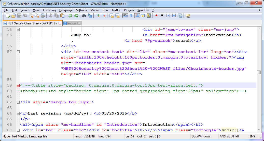
Removing that got us 50% of the way there… then we just needed a bit more CSS to clean it up:
/* For code examples, make any long text add a scrollbar to the code sample,
not the whole window */

pre { overflow-x: auto; }

/* For any text that isn't broken up by a space, force it to wrap if it's too long */

body { word-wrap: break-word; }

/* For smaller width screens (less than 768px) */

@media (max-width: 767px){

	/* Move the left navigation panel so it's below the content */
	#mw-panel { position: static !important; }

	/* Get rid of the margins for the content as there's no left nav now */
	#left-navigation,#footer,#content { margin-left: 0 !important; }

	/* Fix the navigation to that it fits properly on the screen */
	#left-navigation, #right-navigation  { float: none; }

	/* Move the search bar to float to the right */
	#p-search { float: right !important; }

	/* Make the search input box a bit smaller so it fits */
	div#simpleSearch { width: 8em; }

}
And voila! Let’s see how long it takes them to implement :)